Very special thanks to Dimitrios Dimitriadis for permission to reproduce this article.
|
|
|
Renowned and published UK based graphic artist Mark Wilkinson, responsible for the "Prisoners in Paradise" cover illustration has an impressive portfolio. He has given new life to the world of fantasy art - a field in which Mark has proven himself somewhat of a 'guru'. His book and website titled "The Masque" feature a brilliant array of his detailed work. His clients? Iron Maiden, Bon Jovi, Judas Priest, Asia, Megadeth, Marillon, Fish, Peter Gabriel and EUROPE - to name but a few. Recently, Mark agreed to do an interview for the ESC of Oceania in which he recalls the creative process and artwork rationale of the Prisoners in Paradise project. Along the way, Mark introduces and explains exciting never-seen-before alternative designs of the Prisoners in Paradise cover. |
|
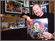
Above: Mark Wilkinson pictured with some of his art at an exhibition. |
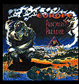
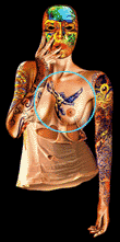
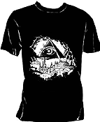
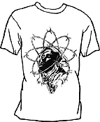
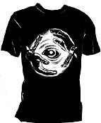
Dimi: Hi Mark, - first and foremost our thanks are extended to you for taking the time to answer a few queries regarding the "Prisoners in Paradise" album art. There is no doubt that you have great talent in producing inspiring graphics that literally propell us into an imaginary realm which is punctuated with pure fantasy. Your work has included (among others) album art for bands such as Marillon, Judas Priest, Iron Maiden and, of course, EUROPE. Album art of the band EUROPE is commonly discussed online in the fan forums, chatrooms and messageboards - I guess one of the common questions is "where did you get your inspiration from when it came to producing the PIP cover?" Mark: Tor Nielsen, the bands' Stockholm-based manager contacted me through their merchandise company: Bravado. This is one of the main companies who sets up all the T'shirt designs and tour brochures that the bands sell whilst on tour. I have worked for Bravado a lot over the years, everything for the early Marillion shows of course and also the 'Monsters Of Rock' festivals that they promoted every year. I also designed T'shirts for Judas Priest, Bon Jovi, Dio, Scorpions etc. that got me noticed by EUROPE and specifically Joey who, I was told, was a fan of my work. Tor's brief to me was pretty sketchy...the title which was called 'Prisoners In Paradise' was originally meant to be a reflection of the state of mind of people living in exile, perhaps even tax exile, he wasn't specific which. I was also given some track titles on the album, and maybe some lyrics, I'm a bit hazy about that though. Although by the look of the first colour rough (see: Prisoners Rough 1 - left) the first line of 'Prisoners in Paradise' is 'I want to learn how to fly'. Which is illustrated with the angel figure. I had the main figure [strait-jacketed] in my mind pretty much from the beginning and this remained in place over the three variations of the cover design I submitted to the band. I believe with the first rough idea I set the main figure inside a biological cellular structure as a sort of symbolic metaphor of the 'trapped' or caged figure. He/she (never was determined if it was a he or she on purpose) looks on at the angel flying free in wistful envy. Why I had the character in a straitjacket is a mystery to me. There must have been some logic to that idea at the time but it escapes me now! Maybe it enhanced the idea of being trapped. Also the line in the song...'Just like prisoners in paradise, Still far from heaven's door' reinforces the almost biblical look to the figure and perhaps that's why I had the angel there in that first rough. Dimi: Were you given the album title to work from, or a cassette to listen to, or is the visualising process purely a spontaneous one? Mark: I was just given the title: 'Prisoners Of Paradise' as mentioned before. I may have had lyrics but I can't be sure. I am sure however that I had at no time been given tapes or rough demos which was a shame as I like to work with the music on in the background. The visualising process is that I usually start with doing very tiny rough drawings...not more than a few inches square. This way I don't get too precious about the image at that stage, but concentrate on the design and layout more with the perspective roughly in place. I then get the elements worked out and stage by stage the rough gets more finely tuned. Dimi: We know that there were several 'tentative' titles suggested for the album whilst in production. Initially I believe the recording was to be titled "Break Free", and was later changed to "Prisoners in Paradise". Did the name change dramatically effect the direction of your creative process? Mark: As I have said the title was always going to be 'Prisoners Of Paradise' as far as I was aware at that stage. Although now you come to mention it the 'Break Free' title could well have had an effect on my thinking process of making the central figure in shackles of some kind. Perhaps Tor mentioned this early title to me, I just can't remember. Dimi: Was the end result a million miles away from your initial drafts? Mark: Stage 2 of the 'roughs process' (see Prisoners Rough 2 - left) was after Tor had told me that the band loved the main figure of the first rough but were unsure about the 'cell' setting for him/her (too obscure) or the angel and the heavenly clouds opening up for that matter! I used the angel for something else though as I liked him. I changed him to a her for part of the cover design to 'Masque' (see Masque Tattoo - left) this time as a tattoo. I don't like to lose ideas if I can help it....what's not appropriate for one job can be stored away and used later. In this case ten years later! Anyway, I worked more on the 'Paradise' angle being an 'earthly' paradise and perhaps a mountain of glittering rubble, like a treasure trove. Mix in a few toxic waste bins too, to indicate that all was not well in this paradise....that no matter what riches we possess, it's not worth a hill of beans if you are not happy in yourself! You can just as easily be trapped by fame and riches as in obscurity and poverty if your state of mind isn't right. This was the first time that the 'Illuminatus Pyramid' appeared. The 'eye in the pyramid' is a well known symbol that appears on the back of a dollar bill and so fitted the concept of fiscal paradise (that is, being rich) and is also well known as the symbolic logo of the 'Illuminati' from the famous fantasy book 'Illuminatus' which was a favourite of mine. The band liked that part of it but they remained unconvinced about the 'hill of treasure'. So....back to the drawing board for me! The third rough however was where I seemed to crack the concept completely! (see Prisoners Rough 3 - left). I set the scene in the desert, with the 'golden' city in the distance, almost like a mirage. The figure is at once 'outside' the city, 'outside' the utopian ideal created for him/her. A rejection of the perfect world, why it's rejected we are not told, perhaps paradise has a cost that we don't know about? The sky now is the only indication of a figure still trapped... graphically hinted at by the ring of clouds around the main character. Well, it made sense to me at the time! All the elements seemed to fit and everyone was extremely happy with it. I also designed 3 T'shirt ideas for the band (see T'shirt 1, 2 and 3 - below) based on the concepts used for "Prisoners...". Dimi: To what degree did Joey and the other members of EUROPE have input into the artwork? Were they regularly shown working progress, or did band management often play the "middle-man"? Mark: Tor Nielson was in regular contact with the band, I had no discussions with them directly, it was always through the management. Dimi: What equipment/media did you use in producing the art? I know you heavily favour the airbrush as a tool - what do you feel are the benefits of using an airbrush as opposed to, lets say oils and canvas? Mark: I used Gouache paint (watercolour mixed with a white primer), and acrylic 'Magicolour' ink sprayed thru an airbrush. The desert was sprayed first with a dark orange underpaint and the yellows and rusts were applied with a loaded toothbrush and spattered on to get that sandy effect. Airbrushed ink and Gouache paint is very quick drying. Oils can take up to two weeks to dry properly and therefore is unsuitable for a tight deadline which this painting was. I think I had just a week to finish the picture once the roughs were approved. Dimi: With any of your clients, have you ever received an absurd or unimaginable request of artwork content to be depicted on a record sleeve? Mark: The worst was 'Vigil In A Wilderness Of Mirrors', 'The Hill' painting on the inside of the gatefold rather than the cover itself which was Fish's first solo album. The list of figures and scenery in that was endless. It took 6 months to complete. this is discussed in a chapter in 'Masque', 'The Graphic World of Mark Wilkinson, Fish and Marillion' which can be bought online at www.the-company.com Details of the book as well as reviews can be seen online at www.the-masque.com. Dimi: Was there ever a moment during the preliminary discussions of the PIP project that you felt that perhaps something had been suggested that you really would have advised against (Saint Peter ushering a line of convicted felons in striped fatigues throught the pearly gates to heaven, for example)? Mark: No, I was given the title and left to get on with it. Neither the band or management had any preconceived notions of what they wanted, they resisted giving me any pro-active direction and preferred to react to any ideas that I came up with. Dimi: The conceptual stage aside, once the composition had been decided upon, do you recall the approximate time required to complete the final piece of art that was to be passed on for print? Where is that final artwork now? Mark: I had I think about a week, might have been a few days longer, I know the deadline was tight as I met Tor Nielson at his hotel in London to deliver the picture by hand for him to present later in the day to Sony Music who were waiting for it. I had been up all night the night before finishing the illustration. I remember well doing the cacti in the foreground last of all at about 7.00 am in the morning and finishing about half an hour before I had to catch the train! My wife made a panic dash to the station and I fell asleep as soon as I got inside the carriage. A commuter had to wake me up when the train arrived in London. I might still have been asleep otherwise when it pulled back out again to return to Norwich! What a disaster that would have been! The final artwork I think is on the wall of the management offices, or Joey's got it! Dimi: How happy were you with the final product? What was the response from the band and management? Mark: I was very pleased with the end result. I felt that it was one of the most convincing fantasy scenes I'd done up to that point. I had the message relayed back to me via Tor that Joey was delighted with it and in fact wanted to commission me to do the cover painting for his solo album. But I never heard any more about that, so I guess he must have changed his mind. Dimi: Finally, what current projects are you working on? It has been rumoured that there MAY be a EUROPE reunion in coming years - would you be prepared to work with them again? Mark: I am currently finishing a portrait for a composer/pianist in the US called Brittany Maier who I'm sure you'll be hearing a lot of in the coming years. Also I am working on ideas for a well known band but can't say too much about that at the moment as it is all in the planning stage. I worked on the remastered box collection for Judas Priest this year which has just come out as well as designing with my partner the latest Priest album 'Demolition'. I now have a design company called 'L-Space Design' which is me and graphic designer David Axtell and we now do the whole packaging job for CDs, from illustrations either painted traditionally or created digitally to design and artwork supplied on CDrom ready for print. As for EUROPE, I would be delighted to work for them again. Thank you for all your interest on this project, I was flattered to be asked. Dimi: Mark, thanks so much for your comments - I'm certain that fans have enjoyed your recollections of the project, and for the designers amongst us, this has proved to be a valuable resource. An impressive collection of your artwork as well as personal information and projects can be viewed at your personal website: http://www.the-masque.com We strongly suggest that ESC fans check it out! We wish you all the very best and continued success in your extraordinary field! |
|||
|
Prisoners Rough 1 (Including Angel figure)
|
||||
|
Prisoners Rough 2 (Glittering treasure)
|
||||
|
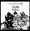
Prisoners Rough 3 (Final Rough)
|
||||
|
Masque Tattoo ("PIP" Angel figure circled)
|
||||
|
|
|